Digital Media Design Work
Below are examples of digital media pieces that I have designed and produced in support of various academic and creative projects.
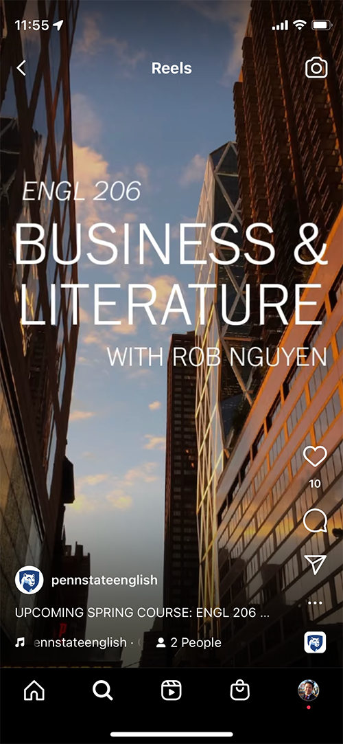
ENGL 206: Business & Literature Course Promotion Materials
To encourage enrollment in my Spring 2022 literature course, I created a postcard style flyer to distribute to undergraduates through my fellow graduate student instructors, and as 45-second video circulated through the department’s Instagram account.

While promotional course posters are often designed for 8.5”x11” dimensions, suitable for a flyer posted on a campus bulletin board, I chose to design this in a postcard style, under the assumption that students would most likely encounter it as either a projected image in class (which would usually be in a landscape orientation), or as an e-mail attachment. In either viewing scenario, this layout makes the course description larger and more easily readable.
In an effort to use all possible means to attract enough students so that the course would run, I created an Instagram Reel video to promote the course as well. The particular challenges of this format included designing video for a vertical orientation (a task I had not previously completed), and communicating essential course information within a very short runtime of under a minute.
I reused some of the postcard elements for sake of efficiency, and to create some visual cohesion between the different promotional materials. Clicking on the below image will open the video on Instagram.com or in the app on your mobile device.
Spring 2020 Speculative Fiction course slide Assignment, Ancillary Justice
Students were asked to create a single presentation slide and present it in class. For the class meeting on Ann Leckie’s novel Ancillary Justice, I attempted to remediate into visual form the identity of the protagonist, Breq.

Because Breq is a fragment of an artificial intelligence, I chose colors and typography that evoke the aesthetic of early computer graphics, including a black background and a limited color palette.
The color yellow marks the visual icons representing Breq and the two different names she uses in the novel, while white text distinguishes personnel file-styled descriptions from the direct quotations.
Rob Nguyen Photography Print Sale, Order Deadlines Image for Facebook and Instagram

The purpose of this piece is to communicate Christmas shipping deadlines to prospective photo print buyers. While these same details could easily be shared as text, I chose to use a simple image overlaid with a few key pieces of information to attract the attention of viewers scrolling through their feeds. This also required careful selection of a photo that had enough negative space that the text could be included without crowding the image.
To create an overarching photo sale story over time, I will use a similar combination of image, typography, and colors for subsequent reminders as each shipping deadline approaches.
“The Shuffle.” short film Facebook Promotional Images
I created these pieces to promote the launch of a short comedy film I wrote, directed, and edited in 2012.

Early “teaser” image.

Image introducing the film’s characters, posted closer to the release date.

Behind the scenes photo, posted a day before the release.
Were I to revisit this project, I would attempt to find more ways to communicate in these pieces the film’s quirky, tongue-in-cheek tone and style. As I hadn’t been able to determine how to do that at the time, I resorted to a minimalist look with consistent typography and color palette, so that the result would at least be aesthetically pleasing and professional looking.